Role
Head of Documentation
Technical writing and developer advocacy for an open-source software startup.

Role
Head of Documentation
Period
2022 – present
Location
Paris, France (remote)
Technology
JavaScript, TypeScript, React, CSS
Company website
Sample work
MUI is an international startup best known for Material UI, an open source React UI library that implements Google’s Material Design. This library is used by millions of developers around the world to build web apps, and it has a large and active community of contributors.
Material UI is the company’s flagship product, but it also maintains a number of other libraries and tools for developers. The vast majority of MUI’s products are free and open source, and the company also offers commercial licenses for more advanced UI components and features.
In 2022 I joined MUI as the company’s first Developer Advocate. I was responsible for creating and maintaining the product docs as well as writing blog posts, tutorials, and technical marketing content to help developers understand and use the company’s products. I helped develop the company’s brand voice and tone, and established processes and best practices for the developer experience team. I also represented MUI at technical conferences and meetups, organizing sponsorship deals and giving talks and workshops.
In 2024 I transitioned to a more specialized role as Head of Documentation, working closely with the product teams and open-source contributors to create and maintain best-in-class API documentation.
Here are some of the projects I worked on at MUI:
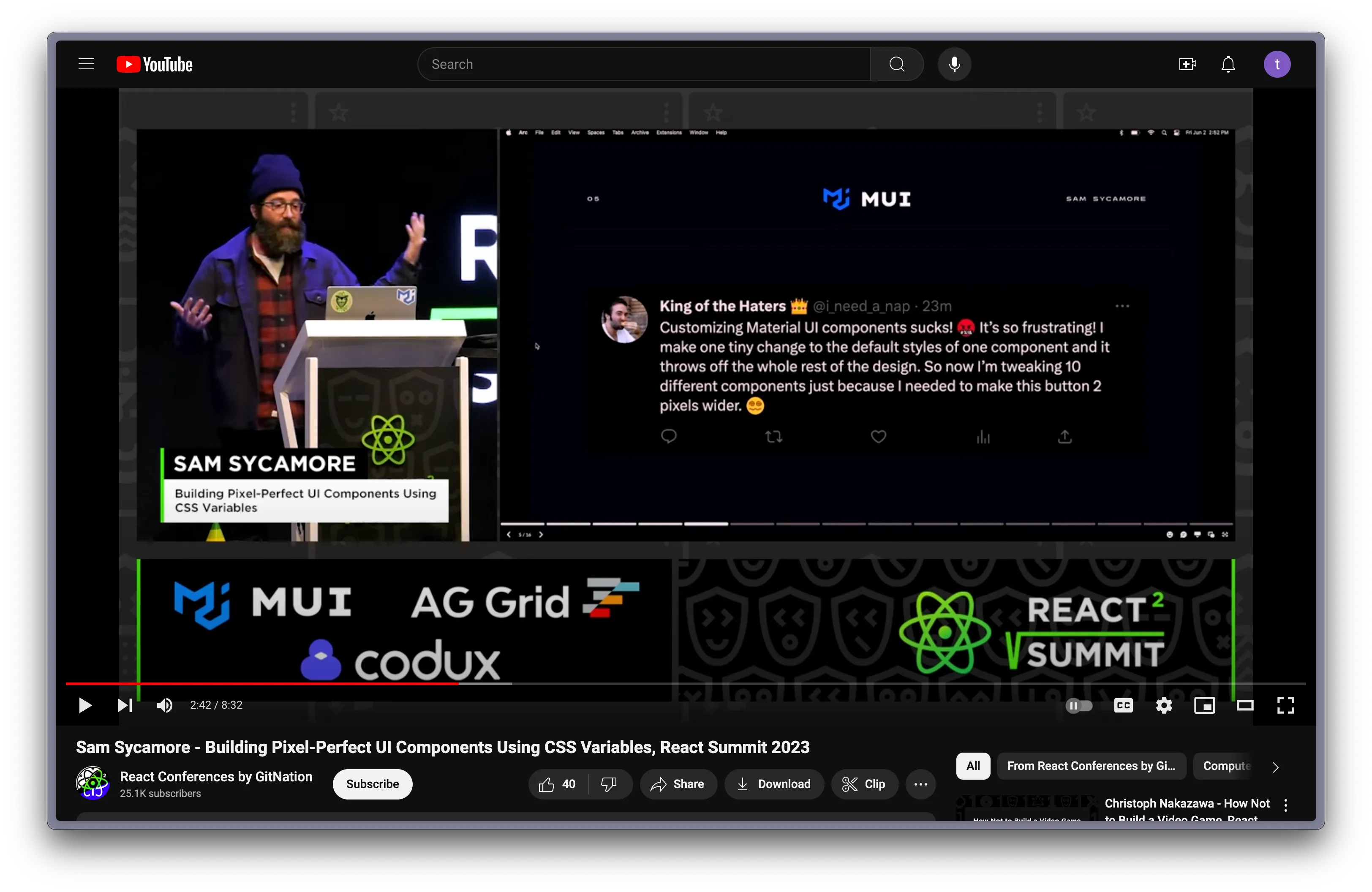
In 2023 the company sponsored the React Summit conference in Amsterdam, which included a booth at the event as well as a lightning talk. I used the stage time to introduce Joy UI, a sister library to Material UI with an updated look and feel as well as new features around customization and theming.
One feature that makes Joy UI unique is its use of CSS variables, which open up new possibilities for a better developer experience when building user interfaces. Aside from introducing new users to the product, my hope was to encourage attendees to think about how they could be using CSS variables in their own projects to ease many of the burdens associated with maintaining styles, themes, and design systems.
The talk immediately led to many conversations about the product with attendees at the company booth, as well as actionable feedback that we were able to take back to the product engineers to improve the API design.
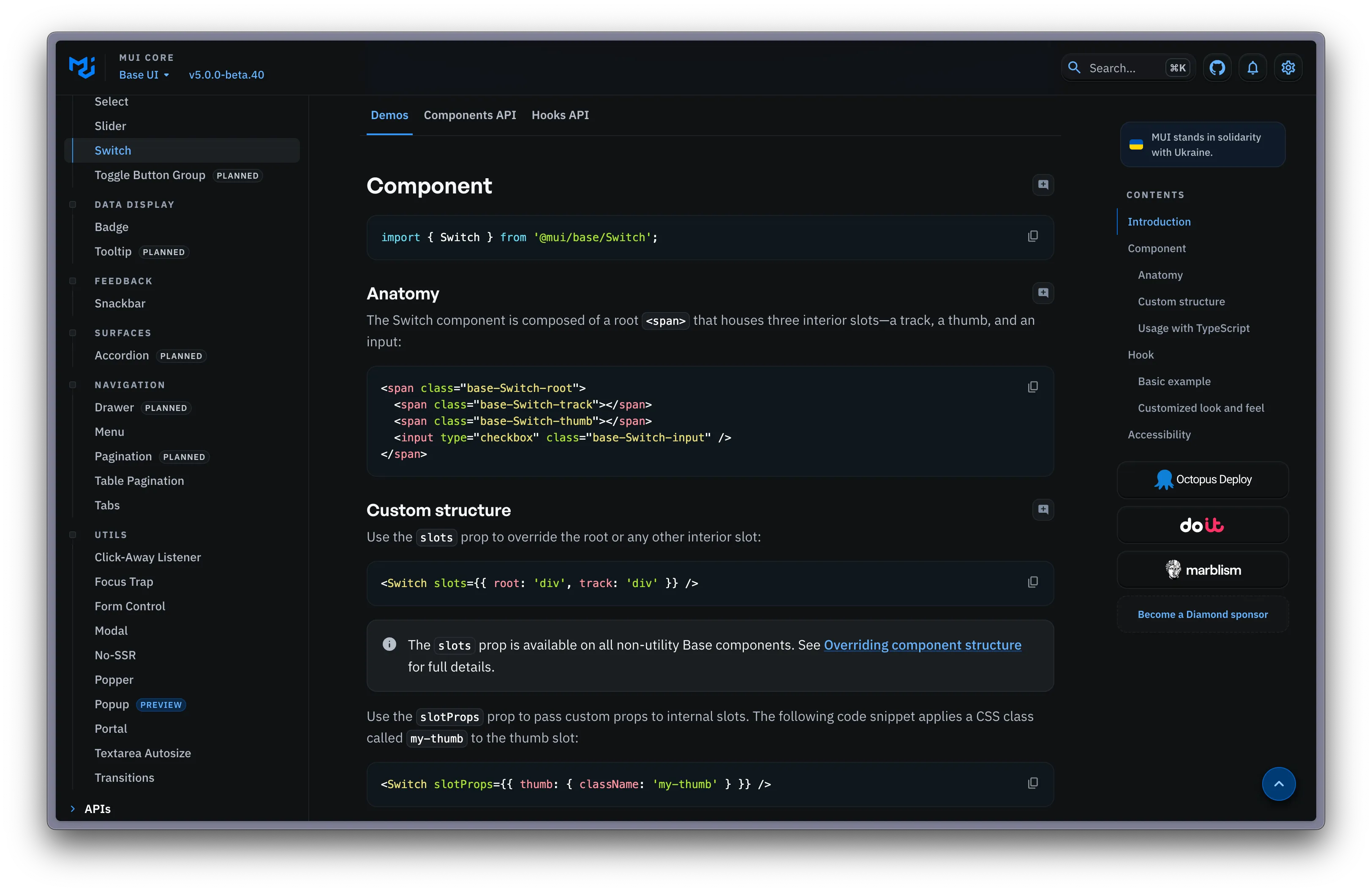
In 2022 the company introduced Base UI, a library of headless UI components extracted from its more opinionated predecessor, Material UI. I took ownership of the Base UI documentation, collaborating with the library’s maintainers to document the component APIs and DOM structure, provide code snippets and demos, and share best practices for usage.
I was responsible for creating and implementing a standard page structure and formatting for each of the component documents. I handled all aspects of the organization and information architecture. I wrote the majority of the text based on earlier drafts and internal notes created by the library’s engineers. I created and implemented the company Style Guide to ensure consistency in voice and tone.
The MUI docs site is built with Next.js and Material UI, and hosted on Netlify. All content is written in Markdown. We took a docs-as-code approach to writing these docs, tracking revisions with git and handling all reviews and edits in GitHub.
This project was part of a larger effort to overhaul the documentation of all of MUI’s products, and it served as an initial testing ground to establish patterns and templates that would be reused in the future.
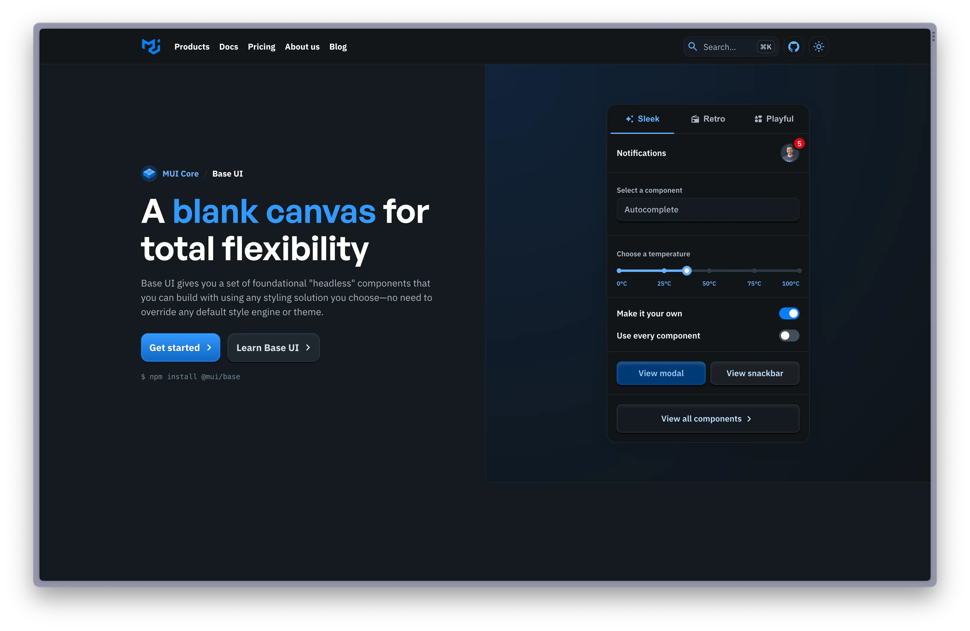
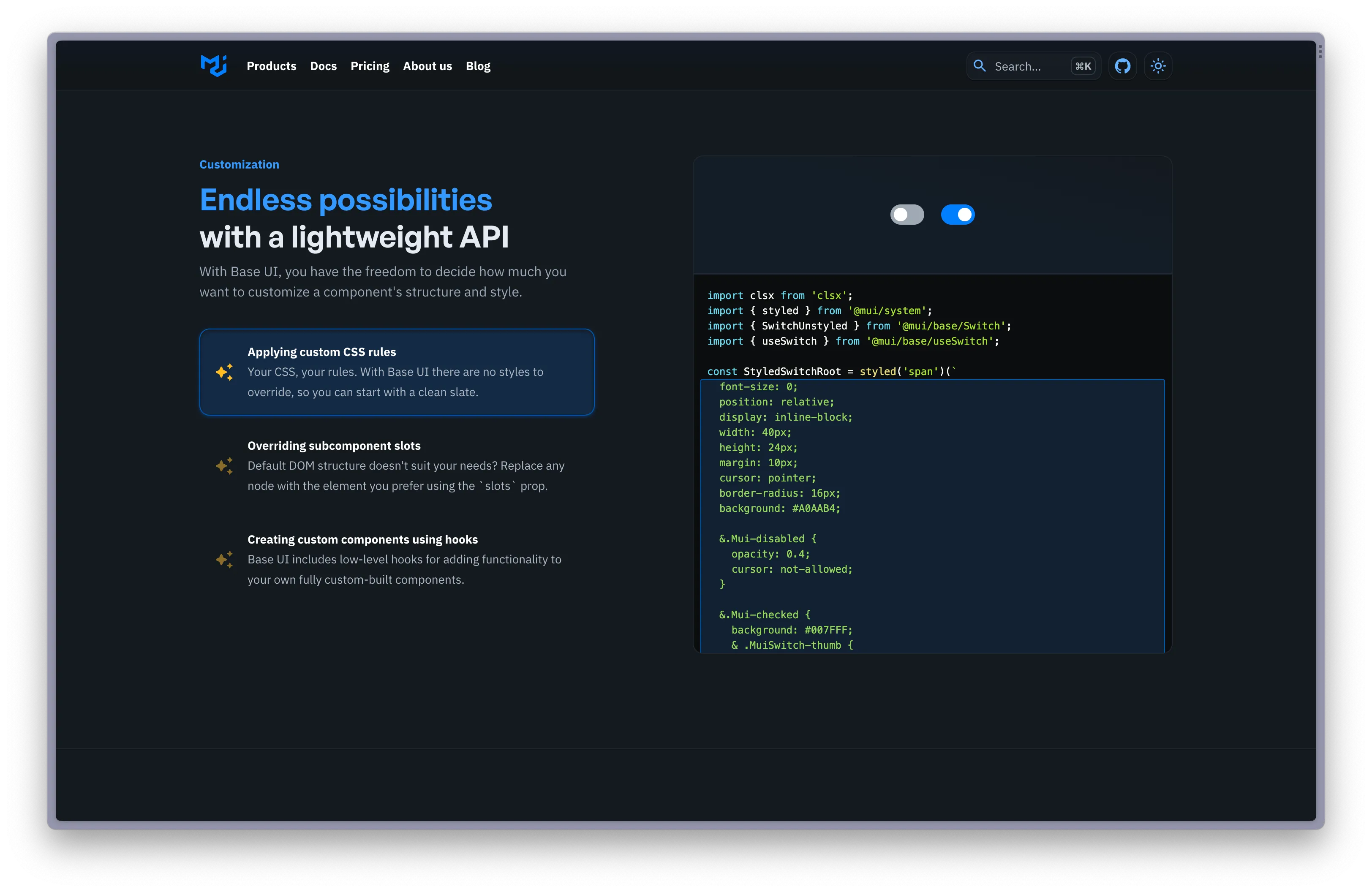
I also took ownership of crafting marketing copy for the Base UI’s landing page, collaborating closely with the product owners and designers to hone in on the key value propositions that make this software stand out on the market.
I started by formulating a brand lexicon with the designers, and we singled out the key terms freedom and flexibility as especially important. Base UI was introduced to meet the needs of users of its sister library, Material UI, who felt that the latter product was too rigid and difficult to customize.
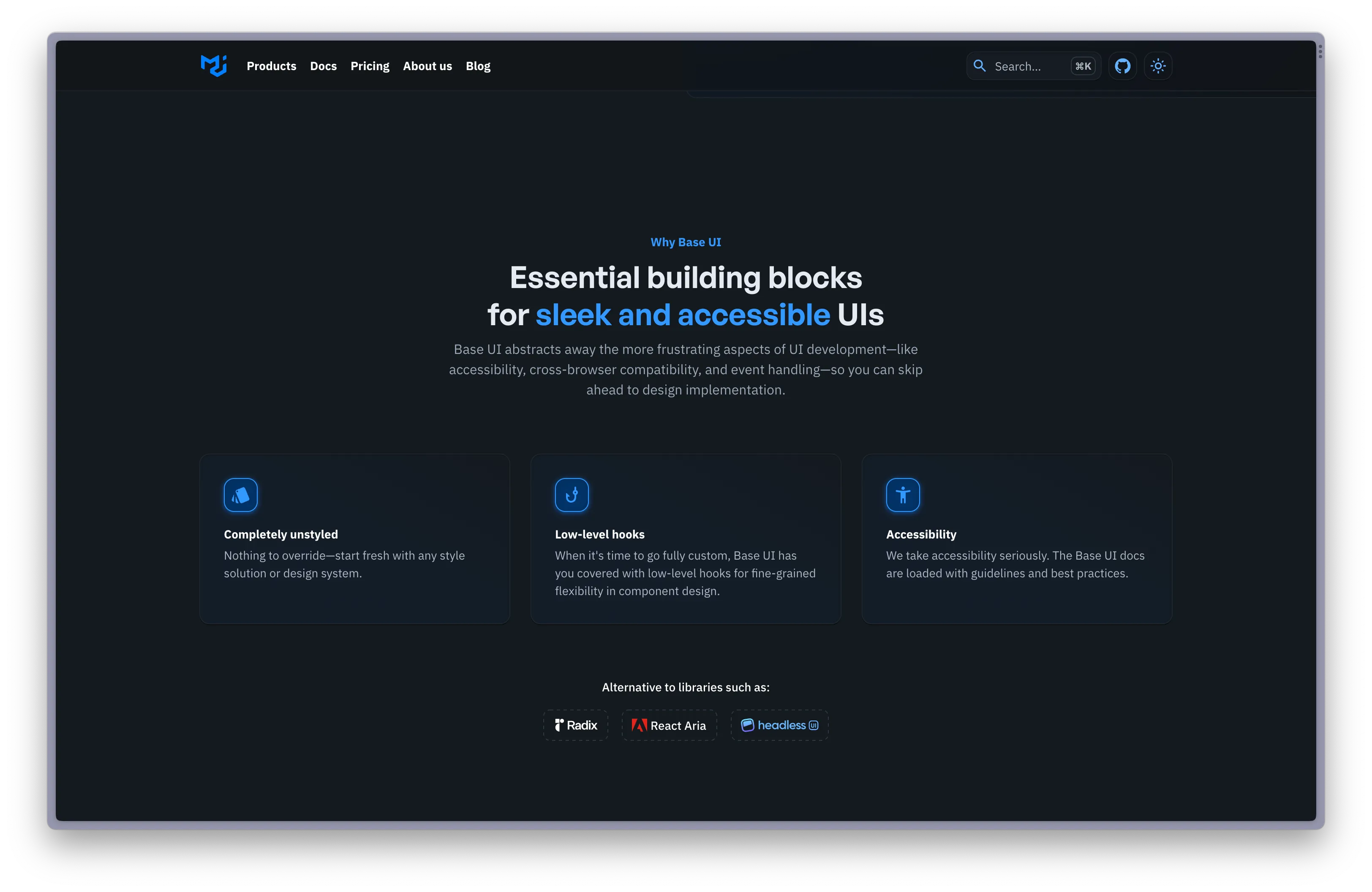
With that in mind, we agreed on “A blank canvas for total flexibility” as the most important statement to feature in the page’s h1 header. Nearly all of the copy that follows across the rest of the page reinforces this idea of maximum flexibility.
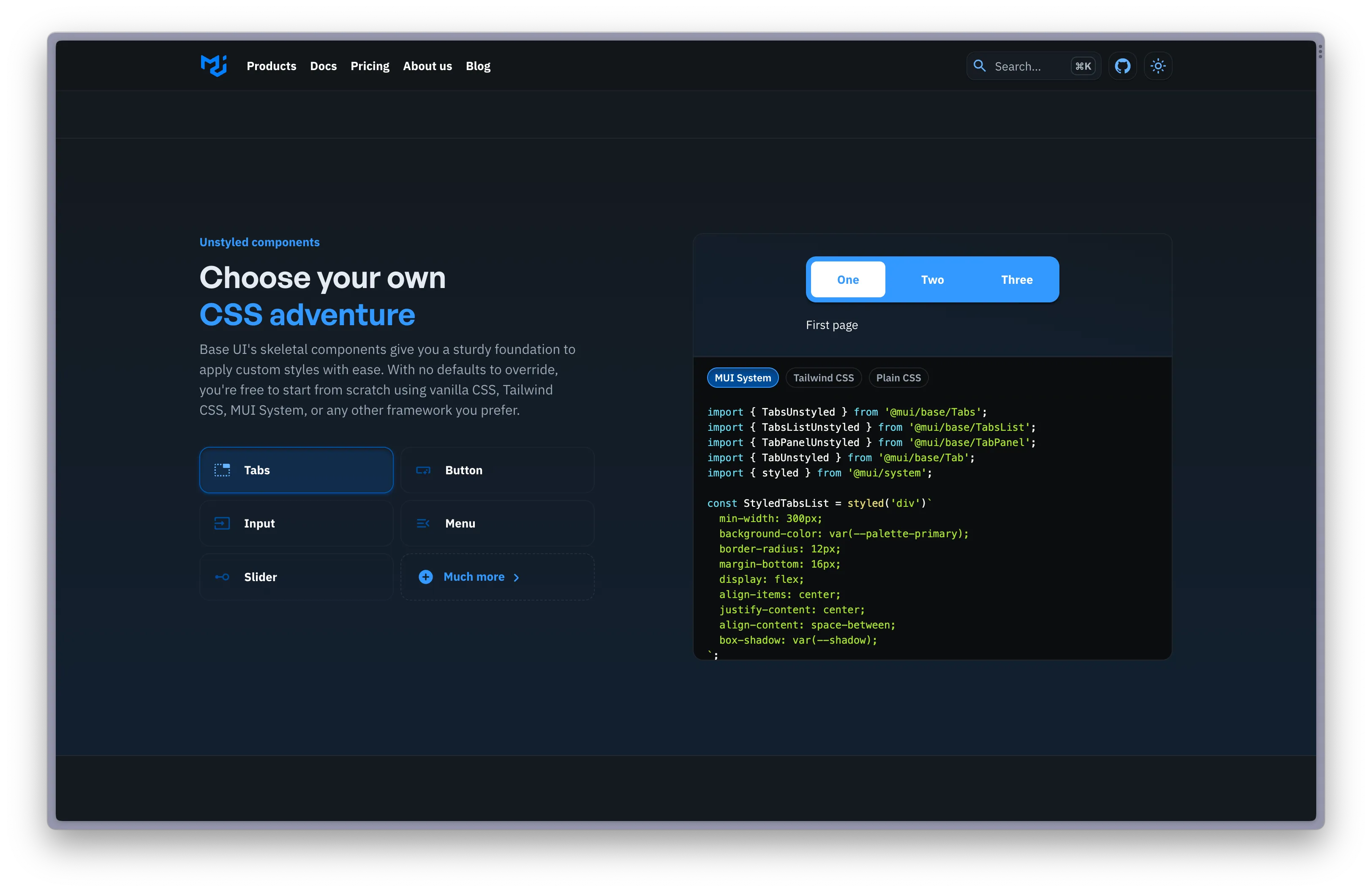
One header that I was really glad made it to the final draft was “Choose your own CSS adventure.” (CSS is the markup language used to add styles to websites, and we wanted to emphasize that Base UI is completely unopinionated about how the developer implements styling.) MUI’s image as a company can sometimes come off as overly sterile, despite the fact that’s it’s a vibrant, young startup. To combat this, the company established a set of values that includes the statement “we’re so not corporate, and we like it that way.” I felt that the “Choose your own CSS adventure” header helped to reinforce this value while adding a more lighthearted tone to what might otherwise be somewhat dry copy.
